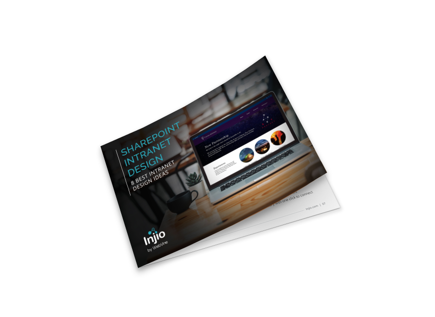
Download our free report on 8 Intranet Design Ideas
8 SharePoint intranet design examples

Sharepoint Intranet Design Best Practices
Great intranet design is more than just good looks. It’s about function, clarity, and connection. Whether you’re building from scratch or refreshing an old setup, here’s what makes a SharePoint intranet truly shine:
- Intuitive navigation – Make it easy for users to find what they need without digging through endless menus.
- Personalised dashboards – Serve up relevant content tailored to roles, departments, or locations.
- Mobile-friendly layouts – Support remote and hybrid teams with responsive design that works on any device.
- Microsoft 365 integration – Connect with the tools your team uses every day to streamline work and boost productivity.
- Smart governance – Keep content clean, compliant, and easy to manage with clear rules and ownership.
- Powerful search – Help users locate documents, pages, and updates in seconds.
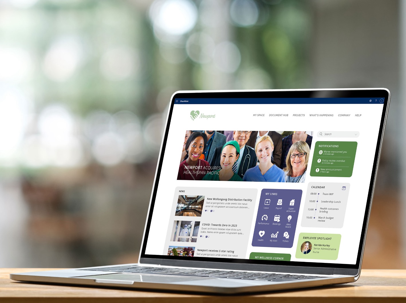
- Clean, modern design – A sleek layout makes your intranet more inviting and easier to use.
Intranet Home Page Design
The home page will likely receive 10 to 20 times more views than any other page on the intranet. Get it wrong and reaching your engagement goals will be almost impossible. Allocate space based on what users are looking for and – sorry – but this is not the latest town hall video or ideation page. 90% of the time, users are visiting the intranet to:
- Find something to help them do their job eg information, a template or system
- Locate and connect with someone for a specific purpose
- Complete an action like requesting leave, equipment or training
Make sure you truly understand what business users – both deskbound and otherwise – want from their intranet. Conduct surveys and focus groups. Prioritise these things in your design: place them at the top with plenty of space.Keep it simple! There’s a difference between simple and unconsidered. Successful design should be so integrated and functional that it’s almost unnoticeable.
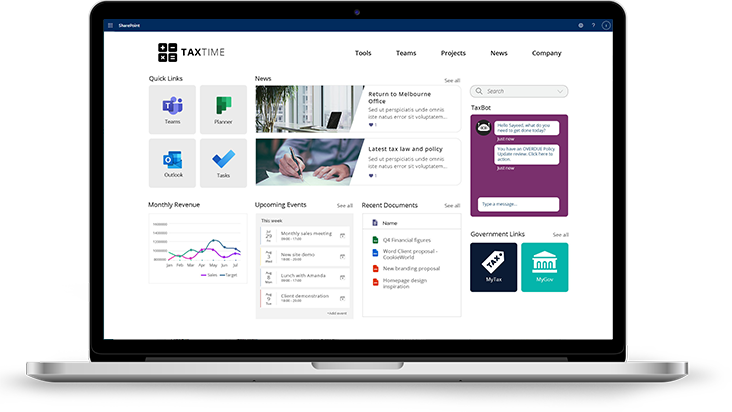
Design is not just what it looks like and feels like. Design is how it works.
Steve Jobs
Intranet Design Examples
SharePoint intranets have an advantage in that the SharePoint modern platform enables clean, attractive, responsive design with minimal technical knowledge.
Although the modern framework imposes limits on the elements that can be used and the style of design, for many organisations it provides the right balance of visual appeal, ease of use and template-driven consistency.
For organisations already using Microsoft 365 and SharePoint, leveraging its knowledge management capabilities to create an attractive, mobile responsive intranet is the logical choice.
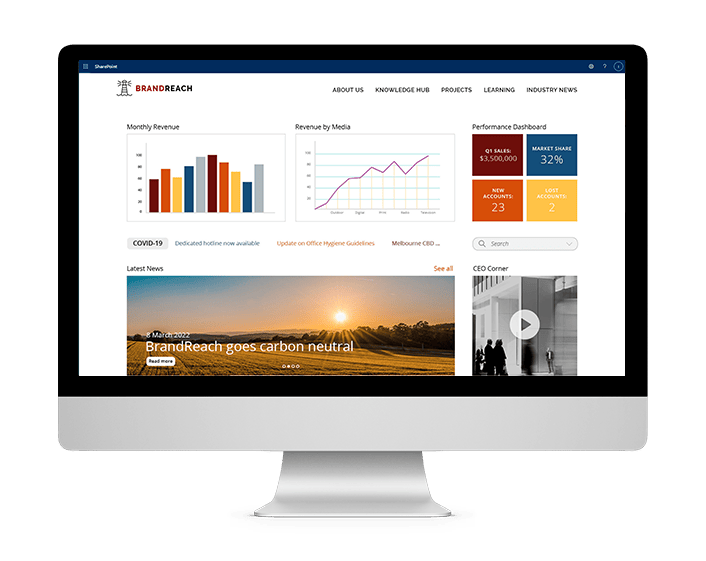
Types of SharePoint Intranet Design
A clean and simple approach to intranet design
A clean and simple intranet design welcomes users with a clear focus on the essential features, represented by intuitive icons on the homepage. Think of it as an easy to navigate dashboard, not a digital maze. Need something specific? A powerful search engine lets you find information fast, without digging through endless menus. Personalised links let you bookmark your go-to pages, documents, & even colleagues, creating a quick access. Empower employees to focus on what matters most.
Download our free report on 8 Intranet Design Ideas
8 SharePoint intranet design examples

Common Intranet Design Mistakes
1. Mimicking your public website
External sites have very different goals to employee portals and – aside from overall branding and colours – should not significantly influence the design.
2. Allocating space on the homepage according to stakeholder seniority
As far as possible, avoid capitulating to political games and negotiations. Ideally the CEO should have the final word to deliver an intranet that will perform, not stroke egos.
3. Not prioritising search
It’s best to give the search function prominence and thoughtful filters. Employees are often more likely to search than navigate using the menu.
4. Not testing with actual users
The most beautiful intranet design in the world will be a failure if it does not help people quickly find what they need. Identify users from different areas with a range of digital abilities and observe them completing common tasks.
5. Not allowing users to customise
Customisation is a central component of successful intranet design. No two users need exactly the same things so allowing them to make their intranet more useful by saving links or following topics will significantly drive adoption.
6. Basing intranet structure on organisational hierarchy
It’s not how people think or search, it’s difficult for new starters and it’s likely to change.
7. Setting and forgetting
It can be such a process to get an approved design that no one wants to revisit the topic ever again! However new technology, branding updates and evolving design aesthetics can make a once-shiny intranet seem dated. You will probably need to re-evaluate at least once every twelve months.
SharePoint Intranet Design FAQs
What is SharePoint intranet design, and why does it matter?
Your SharePoint intranet is more than just a digital bulletin board. It’s the hub for communication, collaboration, and culture. A great design ensures it’s not only functional, but enjoyable. Making it easier for your team to stay informed, connected, and productive.
What are the key ingredients of a successful intranet design?
Here’s what makes an intranet stand out:
- Simple navigation to guide users with ease
- Personalised content for relevance and engagement
- Responsive design for a seamless experience on mobile and desktop
- Tool integration for better workflows
- Fast search so nothing gets lost
It’s about delivering the right content, to the right people, at the right time.
Can I customise SharePoint to match my brand?
Absolutely. SharePoint & Injio gives you full control over how your intranet looks and feels. Add your logo, brand colours, and typography for a cohesive experience. Go even further with custom layouts, branded web parts, and tailored templates that bring your company’s personality to life.
What are common mistakes to avoid?
Even great tools can fall short if not used wisely. Here’s what to steer clear of:
- Too much navigation – Simplify your menus and keep things clean
- Lack of content governance – Keep information relevant, up to date, and well-organised
- Weak search – Prioritise powerful search to save time and reduce frustration
- Ignoring mobile – Your intranet should work anywhere, any time
How long does it take to design and launch a SharePoint intranet?
It depends on your goals. A simple setup could take a few weeks, while a custom-branded experience might take a few months. Either way, we’ll help you create something that works now, and scales for the future.
