Intranet design impacts usability, trust and adoption, and can be the difference between a lively digital hub and a lonely, unloved platform. It’s a difficult job to balance form and function, branding and usability, content and interest vs a clean mobile experience. Especially within the significant constraints of SharePoint modern and – often – multiple stakeholders. The right intranet design solution will depend on which outcomes you want from your intranet so make sure your vision and goals are clear.
Here are 5 SharePoint intranet design examples focusing on different intranet priorities.
1) Personalised intranet design
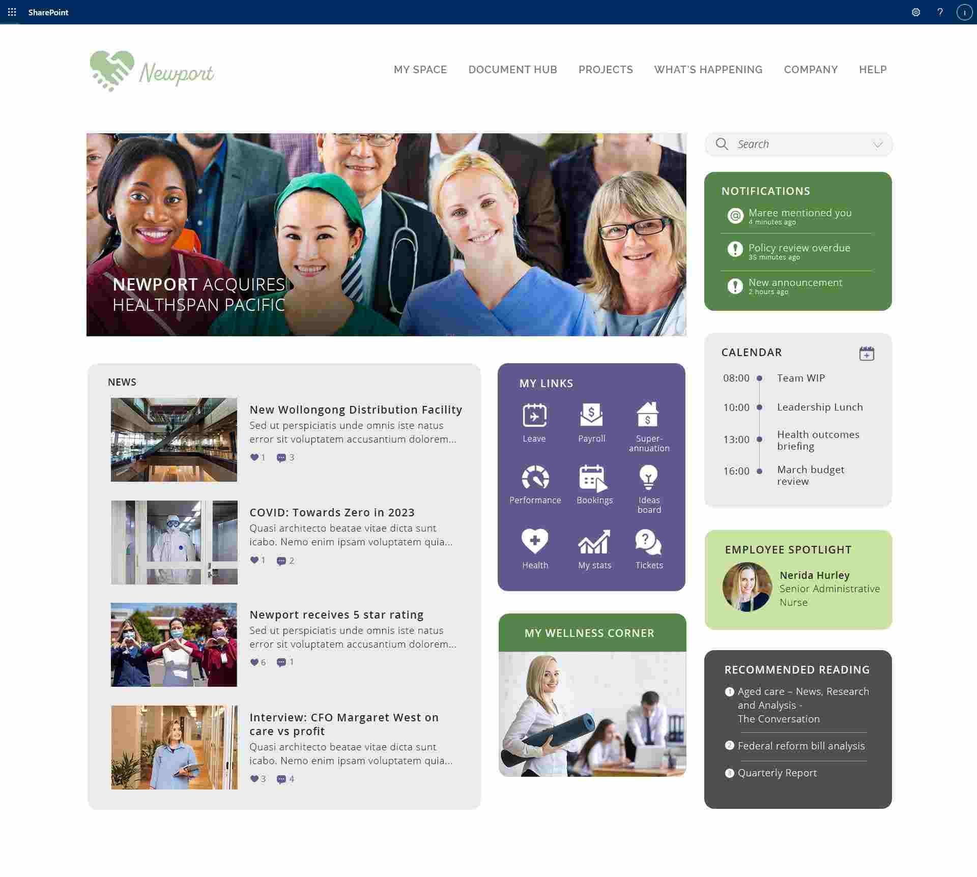
As consumers, our preferences and interests are reflected in the content and offers we receive. Why should this experience be any different in the workplace? Nothing is more interesting than updates about ourselves and for users to invest their time engaging with intranet content, it must be relevant to their needs. It also makes sense to target content based on user characteristics like location, role or department.
2) Clean & Simple intranet design
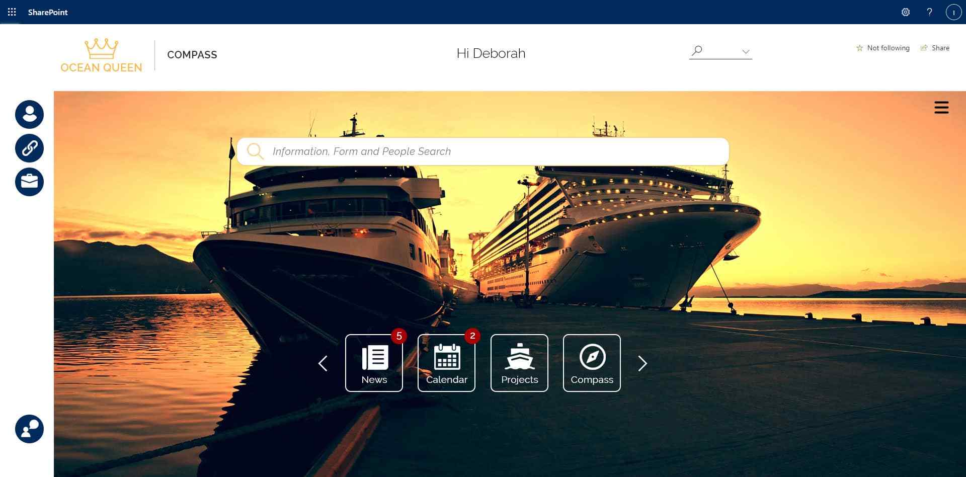
For some organisations, the right home page provides clear focus on the major intranet features, supported by a sophisticated search function. Top pages and modules are featured as icons on the home page, with content pages and documents accessible via a burger menu.
Notifications show the user which areas have been updated since they last visited, and personalised links allow the user to bookmark their own frequently accessed pages, people and documents.
The background image can be updated to provide visual interest and can also feature priority messaging.
3) Informative intranet design
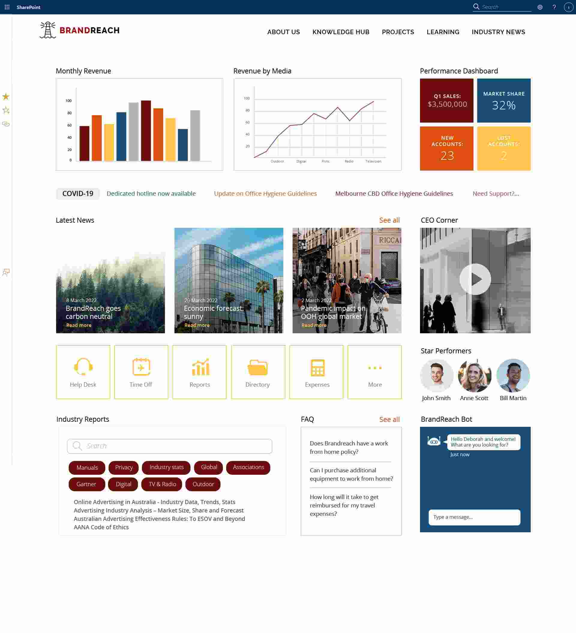
Industries that rely on effective decision-making need a clear intranet design focused on useful, up to date information. Data visualisation via Power BI can deliver the most bang for buck in terms of space utilisation, and targeted updates ensure users are not wasting their time with irrelevant announcements. Helping users absorb key information without needing to have Power BI skills will improve productivity and employee experience.
4) Productivity Powerhouse
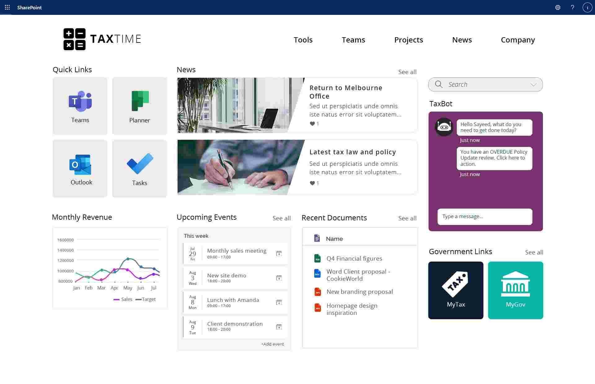
Your company intranet needs to provide more than just the latest news. Organisations are looking to their intranets to deliver productivity enhancements via cost & time saving functionality, enhancing their employee digital experience.
Focusing on productivity doesn’t mean sacrificing social connection or corporate communications. Conversely, having useful, time-saving features means people will naturally be exposed to more communications when they access the intranet every day. Most of the time, helping people do their jobs efficiently – showing them that you respect their time – builds more engagement than any other activity.
5) Mobile First Design
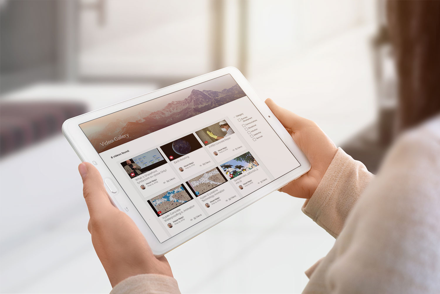
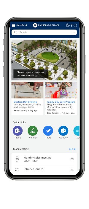
Smartphones have become an essential part of an organisation’s ecosystem, connecting people to information, emails and meetings on the go. Providing access to your company intranet on a mobile device is becoming a priority for many organisations, especially for frontline workers.
Mobile-friendly intranet design rules:
- Ensure adequate spacing between buttons and links
- Optimise images for fast page loading
- Prioritise important information
- Simplify menus
- Focus on search
- Make forms shorter with large text fields and buttons.
Need to create a beautiful, functional intranet fast?
Injio is a SharePoint intranet accelerator with lots of useful features, great UX and strong integration with Microsoft 365. Request our latest guide containing SharePoint intranet design ideas.
This entry was posted in Digital Workplace, SharePoint. Bookmark the permalink

